# Theme assets and styling
Source: https://support.storeconnect.com/articles/theme-assets-and-styling · Last modified 21 August 2026
Theme assets — CSS, JavaScript, fonts, and images — live in the `resources/` directory of your theme and are served to the browser via the asset pipeline.
## Asset directory structure
```
resources/
├── src/
│ ├── scripts/
│ │ ├── theme/ # Core theme JavaScript
│ │ │ └── liquid-components.js # Component reloader
│ │ └── packs/ # Additional script bundles
│ ├── styles/
│ │ ├── theme/ # Core theme CSS
│ │ └── packs/ # Additional style bundles
│ └── files/ # Static files (images, fonts, etc.)
├── build/ # Build configuration
├── dist/ # Compiled output (fingerprinted filenames)
│ └── manifest.json # Maps logical names to fingerprinted filenames
└── package.json
```
## Loading assets
### The `{% require %}` tag
Use `{% require %}` to load CSS and JavaScript files. It ensures each asset is loaded only once, even if required from multiple templates:
```liquid
{% require "styles/theme.css" %}
{% require "scripts/theme.js" %}
{% require "scripts/bundle.js" %}
{% require "scripts/sort.js" %}
```
The `{% require %}` tag is typically used in:
- The layout's `` section for global assets
- Page templates for page-specific assets
- Snippets for component-specific assets
### The `asset_url` filter
Use `{{ "filename" | asset_url }}` to get the URL for a static asset:
```liquid
```
### Asset resolution
When you call `{% require "styles/theme.css" %}`, the platform:
1. Looks up `dist/styles/theme.css` in the custom theme's `manifest.json` (if one exists).
2. Falls back to the base theme's `manifest.json`.
3. Resolves the fingerprinted filename (for example `styles/theme.LBH765JF.css`).
4. Renders a `` or `
{% endif %}
```
### Page-specific assets
Load assets only on the pages that need them:
```liquid
{%- comment -%} pages/product.liquid — load bundle JS only on product pages {%- endcomment -%}
{% if current_product.is_bundle? %}
{% require "scripts/bundle-v2.js" %}
{% require "scripts/quantity-picker.js" %}
{% endif %}
```
### Store-level custom CSS and JavaScript
Stores can have custom CSS and JavaScript configured in the CMS. Include them in your layout:
```liquid
{% if current_store.global_css != blank %}
{% endif %}
{% if current_store.global_javascript != blank %}
{% endif %}
```
## Custom CSS and JavaScript loading
Custom themes inject their own CSS and JavaScript through two mechanisms:
**1. Theme supplement files** — Upload `theme-supplement.css` and `theme-supplement.js` as theme assets. These are automatically injected via the layout's `{{ theme_supplement_stylesheet }}` and `{{ theme_supplement_javascript }}` variables. This is how most client themes add custom styling.
**2. The `{% require %}` tag** — Load assets from `resources/dist/`. Custom themes can provide their own `resources/dist/manifest.json` to override or extend the base theme's assets.
:::note
The base CSS/JS provided by the platform is a reference implementation — not required. See [Base CSS/JS is optional](#base-cssjs-is-optional) below for details.
:::
### Example: overriding the site font with a supplement
Add a theme asset with the key `theme-supplement.css` containing:
```css
body {
font-family: "Comic Sans MS";
}
```
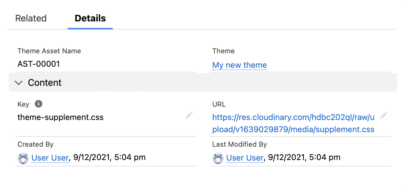
Preview the site. The new asset has overridden the site font, and the rest of the built-in theme still applies.
## Translations
Translation strings are stored in `translations/en.default.json` and accessed with the `t` filter:
```liquid
{{ "products.show.add_to_cart" | t }}
{{ "checkout.title" | t }}
```
Translation file structure:
```json
{
"products": {
"show": {
"add_to_cart": "Add to Cart",
"discontinued": "This product has been discontinued"
}
},
"checkout": {
"title": "Checkout"
},
"cart": {
"header": "Shopping Cart"
}
}
```
## Theme variables
`theme_variables` provides key-value configuration for the theme. These are stored as theme variable records in StoreConnect. The built-in theme provides defaults (for example `products.per_page: 12`) that custom theme variables override.
```liquid
{% assign per_page = theme_variables["products.per_page"] %}
{% assign show_compare = theme_variables["products.comparisons"] == true %}
{% assign image_ratio = theme_variables["images.ratio"] %}
```
## Customizing the base theme with CSS variables
The quickest way to rebrand the base theme is to override its CSS custom properties — variables the base CSS exposes for colors, fonts, and spacing on `:root`. There are two places to set those overrides:
- **Store global CSS (recommended for per-store branding)** — set the `:root` overrides on the store's `custom_styles` via the `update_store` agent tool. This needs no theme file. `custom_styles` is the same field surfaced in Liquid as `current_store.global_css`, which the layout renders inside a `
 ```
### Asset resolution
When you call `{% require "styles/theme.css" %}`, the platform:
1. Looks up `dist/styles/theme.css` in the custom theme's `manifest.json` (if one exists).
2. Falls back to the base theme's `manifest.json`.
3. Resolves the fingerprinted filename (for example `styles/theme.LBH765JF.css`).
4. Renders a `` or `
{% endif %}
```
### Page-specific assets
Load assets only on the pages that need them:
```liquid
{%- comment -%} pages/product.liquid — load bundle JS only on product pages {%- endcomment -%}
{% if current_product.is_bundle? %}
{% require "scripts/bundle-v2.js" %}
{% require "scripts/quantity-picker.js" %}
{% endif %}
```
### Store-level custom CSS and JavaScript
Stores can have custom CSS and JavaScript configured in the CMS. Include them in your layout:
```liquid
{% if current_store.global_css != blank %}
{% endif %}
{% if current_store.global_javascript != blank %}
{% endif %}
```
## Custom CSS and JavaScript loading
Custom themes inject their own CSS and JavaScript through two mechanisms:
**1. Theme supplement files** — Upload `theme-supplement.css` and `theme-supplement.js` as theme assets. These are automatically injected via the layout's `{{ theme_supplement_stylesheet }}` and `{{ theme_supplement_javascript }}` variables. This is how most client themes add custom styling.
**2. The `{% require %}` tag** — Load assets from `resources/dist/`. Custom themes can provide their own `resources/dist/manifest.json` to override or extend the base theme's assets.
:::note
The base CSS/JS provided by the platform is a reference implementation — not required. See [Base CSS/JS is optional](#base-cssjs-is-optional) below for details.
:::
### Example: overriding the site font with a supplement
Add a theme asset with the key `theme-supplement.css` containing:
```css
body {
font-family: "Comic Sans MS";
}
```

Preview the site. The new asset has overridden the site font, and the rest of the built-in theme still applies.
## Translations
Translation strings are stored in `translations/en.default.json` and accessed with the `t` filter:
```liquid
{{ "products.show.add_to_cart" | t }}
{{ "checkout.title" | t }}
```
Translation file structure:
```json
{
"products": {
"show": {
"add_to_cart": "Add to Cart",
"discontinued": "This product has been discontinued"
}
},
"checkout": {
"title": "Checkout"
},
"cart": {
"header": "Shopping Cart"
}
}
```
## Theme variables
`theme_variables` provides key-value configuration for the theme. These are stored as theme variable records in StoreConnect. The built-in theme provides defaults (for example `products.per_page: 12`) that custom theme variables override.
```liquid
{% assign per_page = theme_variables["products.per_page"] %}
{% assign show_compare = theme_variables["products.comparisons"] == true %}
{% assign image_ratio = theme_variables["images.ratio"] %}
```
## Customizing the base theme with CSS variables
The quickest way to rebrand the base theme is to override its CSS custom properties — variables the base CSS exposes for colors, fonts, and spacing on `:root`. There are two places to set those overrides:
- **Store global CSS (recommended for per-store branding)** — set the `:root` overrides on the store's `custom_styles` via the `update_store` agent tool. This needs no theme file. `custom_styles` is the same field surfaced in Liquid as `current_store.global_css`, which the layout renders inside a `
```
### Asset resolution
When you call `{% require "styles/theme.css" %}`, the platform:
1. Looks up `dist/styles/theme.css` in the custom theme's `manifest.json` (if one exists).
2. Falls back to the base theme's `manifest.json`.
3. Resolves the fingerprinted filename (for example `styles/theme.LBH765JF.css`).
4. Renders a `` or `
{% endif %}
```
### Page-specific assets
Load assets only on the pages that need them:
```liquid
{%- comment -%} pages/product.liquid — load bundle JS only on product pages {%- endcomment -%}
{% if current_product.is_bundle? %}
{% require "scripts/bundle-v2.js" %}
{% require "scripts/quantity-picker.js" %}
{% endif %}
```
### Store-level custom CSS and JavaScript
Stores can have custom CSS and JavaScript configured in the CMS. Include them in your layout:
```liquid
{% if current_store.global_css != blank %}
{% endif %}
{% if current_store.global_javascript != blank %}
{% endif %}
```
## Custom CSS and JavaScript loading
Custom themes inject their own CSS and JavaScript through two mechanisms:
**1. Theme supplement files** — Upload `theme-supplement.css` and `theme-supplement.js` as theme assets. These are automatically injected via the layout's `{{ theme_supplement_stylesheet }}` and `{{ theme_supplement_javascript }}` variables. This is how most client themes add custom styling.
**2. The `{% require %}` tag** — Load assets from `resources/dist/`. Custom themes can provide their own `resources/dist/manifest.json` to override or extend the base theme's assets.
:::note
The base CSS/JS provided by the platform is a reference implementation — not required. See [Base CSS/JS is optional](#base-cssjs-is-optional) below for details.
:::
### Example: overriding the site font with a supplement
Add a theme asset with the key `theme-supplement.css` containing:
```css
body {
font-family: "Comic Sans MS";
}
```

Preview the site. The new asset has overridden the site font, and the rest of the built-in theme still applies.
## Translations
Translation strings are stored in `translations/en.default.json` and accessed with the `t` filter:
```liquid
{{ "products.show.add_to_cart" | t }}
{{ "checkout.title" | t }}
```
Translation file structure:
```json
{
"products": {
"show": {
"add_to_cart": "Add to Cart",
"discontinued": "This product has been discontinued"
}
},
"checkout": {
"title": "Checkout"
},
"cart": {
"header": "Shopping Cart"
}
}
```
## Theme variables
`theme_variables` provides key-value configuration for the theme. These are stored as theme variable records in StoreConnect. The built-in theme provides defaults (for example `products.per_page: 12`) that custom theme variables override.
```liquid
{% assign per_page = theme_variables["products.per_page"] %}
{% assign show_compare = theme_variables["products.comparisons"] == true %}
{% assign image_ratio = theme_variables["images.ratio"] %}
```
## Customizing the base theme with CSS variables
The quickest way to rebrand the base theme is to override its CSS custom properties — variables the base CSS exposes for colors, fonts, and spacing on `:root`. There are two places to set those overrides:
- **Store global CSS (recommended for per-store branding)** — set the `:root` overrides on the store's `custom_styles` via the `update_store` agent tool. This needs no theme file. `custom_styles` is the same field surfaced in Liquid as `current_store.global_css`, which the layout renders inside a `