CSS offers flexibility, and ensures your store maintains a cohesive and professional appearance while being easy to manage and update.
StoreConnect comes with its own CSS framework that contains global variables and classes that are customizable. Setting these variables and classes will give you a fast win when creating or customizing your theme. Your changes will be reflected throughout your store, from the home page, products, checkout to account pages.
Understand StoreConnect variables
Most variables in the StoreConnect framework accept direct values. For example, if you want to set the primary color of your store, you can set an RGB, hex, or HSL color value directly on the variable.
:root {
  --sc-color-primary: #0077ff;
}
However, some variables belong to a set of variables. For example, we use the HSL colour system to improve accessibility aspects. Therefore, we provide single variables to set each value for the HSL.
If you want to convert the hex color above into its HSL version, you will need to set each value in its own variable, as follows:
:root {
  --sc-color-primary-h: 212;
  --sc-color-primary-s: 100%;
  --sc-color-primary-l: 50%;
}
This is not the case for every variable, but it applies to any variable related to HSL colors. You can recognise them because they end with -h, -s, and -l.
Colors
For colors, you can use direct values or use the HSL system which offers better accessibility.
When you set your own custom hex and hsl colours, the built-in theme will adapt your colors to all the global components generated by StoreConnect. Skip this step if you already set up colors using the setup wizard.
Primary and secondary colors
:root {
  --sc-color-primary: #0077ff;
  --sc-color-primary-h: 212;
  --sc-color-primary-s: 100%;
  --sc-color-primary-l: 50%;

  --sc-color-secondary: #262626;
  --sc-color-secondary-h: 0;
  --sc-color-secondary-s: 0%;
  --sc-color-secondary-l: 15%;
}
Errors and warning messages, sales tags and text, bonuses tags
Set specific colours for content types. For example, for warnings, you can use the default StoreConnect palette, or use your own red tone to match your brand.
:root {
  --sc-color-error: #e60000;
  --sc-color-error-h: 0;
  --sc-color-error-s: 100%;
  --sc-color-error-l: 45%;

  --sc-color-sale: #e60000;
  --sc-color-sale-h: 0;
  --sc-color-sale-s: 100%;
  --sc-color-sale-l: 45%;

  --sc-color-bonus: #0077ff;
  --sc-color-bonus-h: 212;
  --sc-color-bonus-s: 100%;
  --sc-color-bonus-l: 50%;
}
Header and footer
Set some basic custom colors for header and footer backgrounds and fonts. You can customize headers and footers more, but this is the basic defaults.
:root {
  --sc-header-bg: white;
  --sc-header-color: #1A1A1A;
}
:root {
  --sc-footer-bg: #005FCC;
  --sc-footer-color: white;
}
Fonts
Easily integrate external fonts to align and style your navigation menus, and adjust dimensions, borders, and shadows to match your theme.
Font sources
To use an external font source like Typekit, Google Fonts, or any other source that offers an external link, first paste the external link into the head content block.
If you are using a Google font source, we highly recommend using the liquid code below. It will improve the way your store renders the font without slowing down your site and causing performance issues.
Replace external-link-here with the external URL:
    {% assign font_url = 'external-link-here' %}
    https://fonts.gstatic.com" crossorigin>
It should look like this:
    {% assign font_url = 'https://fonts.googleapis.com/css2?family=Raleway:wght@400;600&display=swap' %}
    https://fonts.gstatic.com" crossorigin>
Site font family
As a final step, set the font family for the entire site. Keep in mind that you can still set multiple fonts. This is just a quick example of how to set the base font for your project.
:root {
  --sc-font-family: 'Raleway', sans-serif;
}
Menus
To change the alignment or position of store menus, you can modify the menu styles.
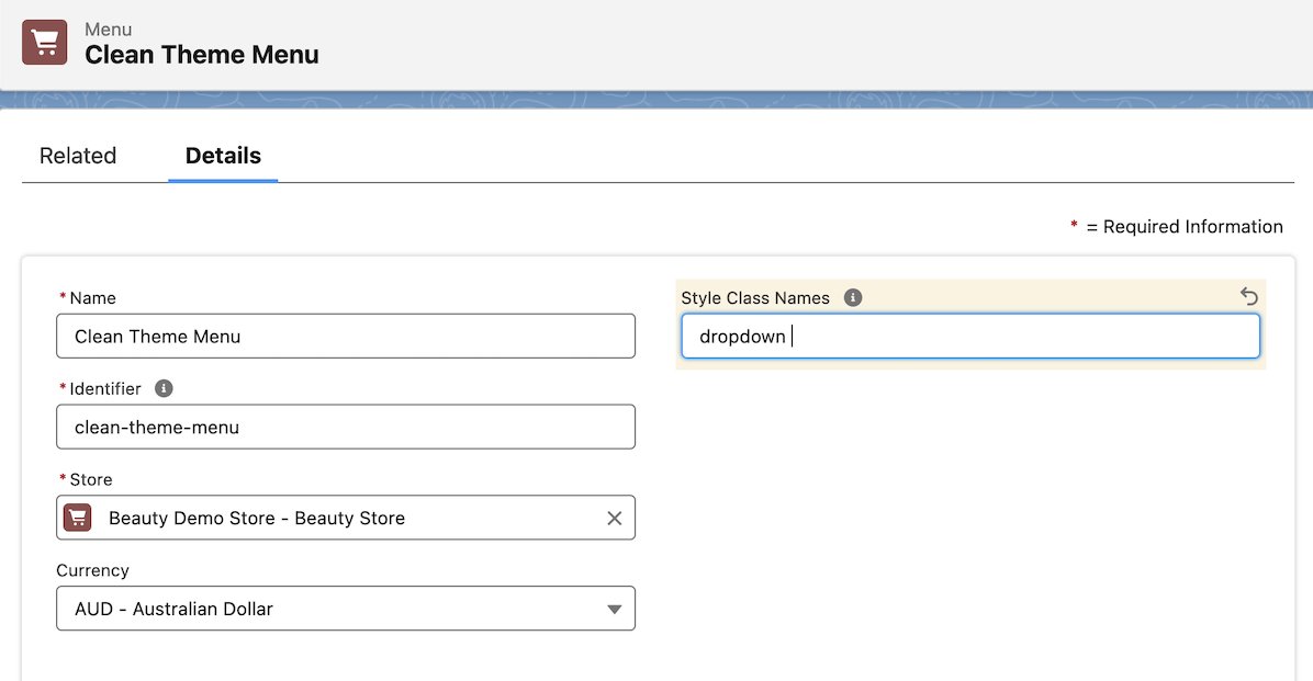
Alignment
center
end
Example using center option

Menu link colour
Change the menu link colours on resting and on hover by setting the hex, hsl, or rgb colours in these variables:
--sc-menu-link-color-resting: #111111;
--sc-menu-link-color-hover: #66CBC1;
Dropdowns and megas
Adjust the mega or dropdown styling by replacing the values of width
:root {
  --sc-menu-shadow: 0 8px 10px rgba(0, 0, 0, 0.1);
  --sc-menu-max-height: 300px;
  --sc-menu-column-max-width: 300px;
  --sc-menu-column-min-width: 100px;
  --sc-menu-dropdown-width: 400px;
}
Custom dimensions
Adjust the maximum widths of your content by overriding the default max-width values of specific global classes. In StoreConnect, we provide a range of component and utility classes that help you define padding, margins, widths, heights, and more. These classes are essential for constructing various content blocks and global components like cards and navbars.
Occasionally, you may require a specific maximum width that creates a boxed effect throughout your entire store. While you could target individual content blocks to achieve this, it may not maintain consistency with your theme’s spacing and verticals.
Let’s say all components, content and custom content blocks should reach a max-width of 1200px across all site and always centered.
Set the max width to a custom variable
--sc-max-width: 1200px;
Apply the custom variable to global classes
.SC-Navbar_inner,
.SC-Header_inner,
.SC-Notice,
.SC-Breadcrumb,
.SC-ContentBlockContainer_header,
.SC-ContentBlockContainer_body:not(.sc-expand),
.SC-ContentBlockContainer_footer,
.sc-container:not(.sc-container-expanded),
.sc-container.sc-container-spacious,
.SC-Grid,
#SC-categories-show h1 {
  max-width: var(--sc-max-width);
  margin-left: auto;
  margin-right: auto;
}
Feel free to add more classes that you think are relevant. This is another example on how you can customize the dimensions of global components but you can also set custom max widths to articles or page content.
Borders and shadows
Change the border radius and border rounded radius depending on your theme needs. These are reflected in buttons, cards, headers and notes bars.
:root {
  --sc-border-width: 1px;
  --sc-border-color: hsl(0, 0%, 85%);
  --sc-border-radius: 3px;
  --sc-border-rounded: 15px;

  --sc-shadow: 0 1px 2px hsla(0,0%,0%,0.1);
}
StoreConnect by default looks like this:
If you set --sc-border-radius: 0px; you'll get this:
Tips and suggestions
- To make things simple, you can reuse variables in your custom CSS. For example, if you have a custom content block template and want to set the primary font color, you can do so without repeatedly writing the hex code for the color.
.your-custom-class {
  font-color: var(--sc-color-primary);
}
You can also set all the variables within just one :root {} bracket, you don’t have to repeat it unless you have an internal convention to do so.
- Use style blocks or upload a master file to the theme assets.
- Keep a realistic and easy naming convention.
- External libraries can slow down your application, instead customize what you exactly need.
- When styling your store, consider patterns and theme styling, style specific content block only when it is strictly needed. Avoid ending up with a huge amount of CSS that can become hard to manage.
- Stick to StoreConnect layouts first and then customize using the theme builder. This will help you to maintain a robust set of reusable components.