

Style the POS
On this page
Use this process to change how the point of sale looks for your staff, for example to put your brand color through the app, or to color the buttons staff use most so they stand out on a busy counter.
The POS is used mostly by staff rather than customers, so good customization is less about decoration than about helping staff work faster, more consistently, and with fewer mistakes. Keep that in mind when deciding how far to go.
Work through these methods in order, and use the first one that does the job:
- Settings in Salesforce for action buttons and screens.
- Design tokens for colors, type, and sizes across the whole app.
- Your own CSS in a view for markup you write yourself.
- CSS on the app’s own classes, as an advanced last resort.
How POS design works explains the action groups, layouts, and views these settings belong to.
What you can change in Salesforce
| To change | Set | See |
|---|---|---|
| An action button’s color | Color on the POS Action Item | POS layouts |
| An action button’s icon or image | Icon or Image on the POS Action Item | POS icons reference |
| An action button’s label | Display Name on the POS Action Item | POS action groups |
| Whether a screen shows rows or cards | Page Type on the POS Layout (list or grid) |
POS layouts |
| Which fields a screen or card shows, and in what order | The layout fields on the POS Layout | POS layouts |
| What printed receipts and documents look like | A print template | POS print templates |
Not every button on the POS is an action item. Action buttons are the ones you configure: the sidebar and top bar, action group menus, and the primary and secondary buttons on a layout. Buttons that are part of the app itself take their colors from the design tokens instead.
Color an action button
- Open the POS Action Item record for the button.
- Set Color to a hex value, such as
#7B2D8E. - Select Save.
- Wait for the change to reach the POS, then reload the POS on the register.
The POS picks a readable text color and a hover shade to go with the color you set, so you do not need to choose them. A value it cannot read as a color is ignored, and the button keeps the default style.
The button now shows in the new color on the register, with light or dark text chosen to contrast with it.
Recolor the POS with design tokens
Design tokens are the named values the POS app and the components in it are styled from, such
as --sc-color-primary. Their names are designed to stay stable, and changing their values
is what they are for, so this is the safest way to change how the whole app looks.
Tokens are also wide-reaching and predictable. Set one once, and every component that uses it follows, so you get a consistent result across the app with less work than styling each element. You set them in a Style Block.
Before you start
- You need access to the Style Blocks list. If you cannot see it in the App Launcher, ask your Salesforce administrator for tab and object access.
- You need a register you can sign in to, so you can check the result.
Create a style block for the POS
- Go to the Style Blocks list and select New.
- Enter a Name you will recognize later, such as “POS brand colors”.
- Set Store to the store the register belongs to.
- Check Active.
- Set Channels to
POS. Channels decides where the style block loads:Webis your online store andPOSis the point of sale app. LeaveWebout, so the values in this block do not also change your online store. - Check Global. A style block that is not global does not load in the POS.
- Set Media to
screen. -
Enter the token values in Content, without
<style>tags. This example sets a dark blue brand color with white text on it:```css
:root { –sc-color-primary: #1F3A93; –sc-color-on-primary: #FFFFFF; } ```
- Select Save.
- Wait about two minutes for the change to reach the POS, then reload the POS on the register.
The prominent buttons, links, and active navigation now show in your brand color, with white text and icons on them.
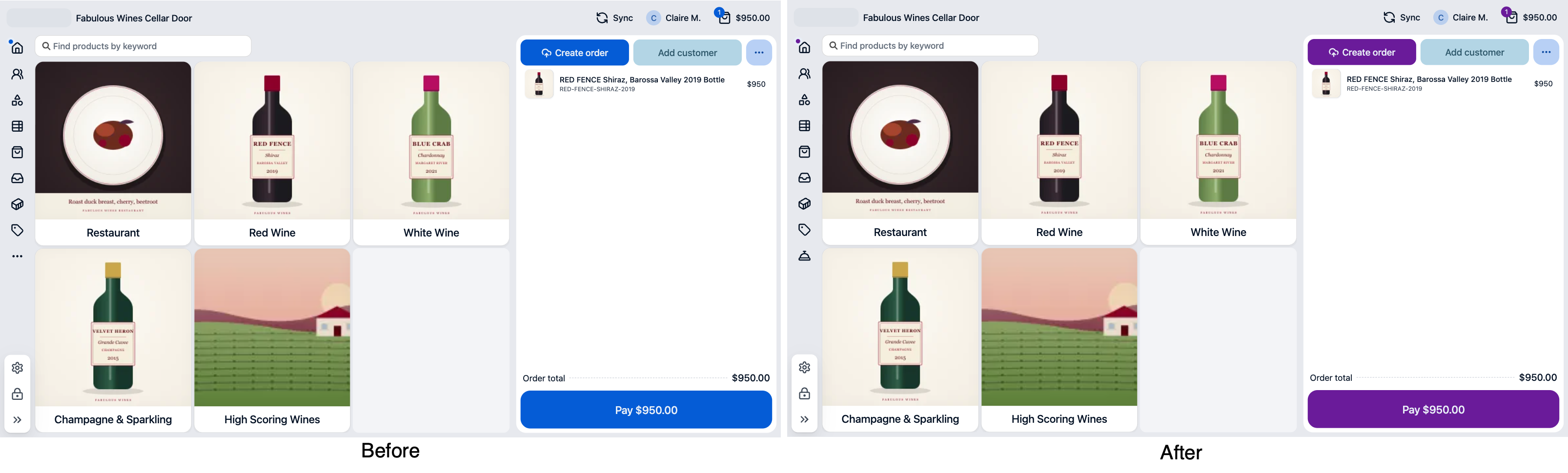
How color tokens work
The color tokens come in pairs: a surface color, and an on- color for the text and icons
that sit on it. --sc-color-primary is the surface for the most prominent elements, such
as major buttons, and --sc-color-on-primary is the color of text and icons on top of it.
Primary marks the main action on a screen or component, such as the submit button on a form. Choose a primary color that draws the eye. A muted color can get lost against the other elements on screen.
Change both halves of a pair together. If the default primary is dark blue with white text and you change it to pale blue, the white text becomes unreadable.
How far a change reaches depends on the token. Changing --sc-color-primary changes every
element that uses the primary color, across every screen. To change one button, set
Color on the action item, or give the button a class of your own in a view.
The POS design tokens reference lists every pair and the type tokens.
:::note
POS tokens and your web theme’s CSS variables are separate sets, even where both start
with --sc-. The web theme’s own stylesheets don’t load in the POS, but a style block
does if Channels includes POS or is left blank. A variable redefined in that block
applies in both, so where the two share a name, it changes both. Set a style block to one
channel to keep them apart.
:::
Style your own markup in a view
A POS view replaces part of a screen with your own HTML, and you own the markup and CSS inside it. Give your elements class names of your own, and use the design tokens for colors so your view matches the rest of the app:
```css
.my-panel { padding: 12px; background: var(–sc-color-surface-raised); color: var(–sc-color-on-surface); } ```
You can also reuse the app’s own class names, such as sc:button, in your view’s markup.
Those classes can change at an upgrade, so test your view after each upgrade if you rely on
them.
Advanced: CSS on the app’s own classes
CSS that targets the app’s own class names can restyle almost anything on the POS. You can do this, but you own the CSS and the trade-offs, and it should not be the default, because the class names are internal and not designed as styling hooks. You take on testing and updating that CSS at each upgrade.
Before you write it, keep these in mind:
- Try a design token first. If a token covers the change, it is easier to maintain and carries across upgrades.
- Styles on shared elements apply everywhere. A rule for every button resizes or recolors the buttons on every screen, including dense ones such as the cart and keypad, so check the result across the app.
- Ask what the change is for. A change that helps staff work is usually worth the upkeep. A change that is only about looks is better made with tokens.
Add this CSS to a POS style block in the same way as the token values above.
If a POS screen looks wrong after an upgrade or a change, uncheck Active on your POS style block, wait about two minutes for the change to reach the POS, and reload. If the screen is then correct, the style block was the cause.
Was this article helpful?
Thanks for your feedback! It helps us improve our docs.