

Theme assets and styling
On this page
Theme assets — CSS, JavaScript, fonts, and images — live in the resources/ directory of your theme and are served to the browser via the asset pipeline.
Asset directory structure
```
resources/ ├── src/ │ ├── scripts/ │ │ ├── theme/ # Core theme JavaScript │ │ │ └── liquid-components.js # Component reloader │ │ └── packs/ # Additional script bundles │ ├── styles/ │ │ ├── theme/ # Core theme CSS │ │ └── packs/ # Additional style bundles │ └── files/ # Static files (images, fonts, etc.) ├── build/ # Build configuration ├── dist/ # Compiled output (fingerprinted filenames) │ └── manifest.json # Maps logical names to fingerprinted filenames └── package.json ```
Loading assets
The {% require %} tag
Use {% require %} to load CSS and JavaScript files. It ensures each asset is loaded only once, even if required from multiple templates:
```liquid
{% require “styles/theme.css” %} {% require “scripts/theme.js” %} {% require “scripts/bundle.js” %} {% require “scripts/sort.js” %} ```
The {% require %} tag is typically used in:
- The layout’s <head> section for global assets
- Page templates for page-specific assets
- Snippets for component-specific assets
The asset_url filter
Use {{ "filename" | asset_url }} to get the URL for a static asset:
```liquid

```
Asset resolution
When you call {% require "styles/theme.css" %}, the platform:
- Looks up
dist/styles/theme.cssin the custom theme’smanifest.json(if one exists). - Falls back to the base theme’s
manifest.json. - Resolves the fingerprinted filename (for example
styles/theme.LBH765JF.css). - Renders a
<link>or<script>tag with the resolved URL.
The {{ "filename" | asset_url }} filter resolves static files through the same manifest system.
Including assets in the layout
```liquid
{%- comment -%} layouts/theme.liquid — head section {%- endcomment -%}
{% require "styles/theme.css" %} {{ theme_supplement_stylesheet }} {% if current_store.global_css != blank %} {% endif %} {% require "scripts/configure.js" %} {% require "scripts/metadata.js" %} {% require "scripts/theme.js" %} {{ theme_supplement_javascript }} {% if current_store.global_javascript != blank %} {% endif %}```
Page-specific assets
Load assets only on the pages that need them:
```liquid
{%- comment -%} pages/product.liquid — load bundle JS only on product pages {%- endcomment -%} {% if current_product.is_bundle? %} {% require “scripts/bundle-v2.js” %} {% require “scripts/quantity-picker.js” %} {% endif %} ```
Store-level custom CSS and JavaScript
Stores can have custom CSS and JavaScript configured in the CMS. Include them in your layout:
```liquid
{% if current_store.global_css != blank %}
{% endif %}
{% if current_store.global_javascript != blank %} {% endif %} ```
Custom CSS and JavaScript loading
Custom themes inject their own CSS and JavaScript through two mechanisms:
1. Theme supplement files — Upload theme-supplement.css and theme-supplement.js as theme assets. These are automatically injected via the layout’s {{ theme_supplement_stylesheet }} and {{ theme_supplement_javascript }} variables. This is how most client themes add custom styling.
2. The {% require %} tag — Load assets from resources/dist/. Custom themes can provide their own resources/dist/manifest.json to override or extend the base theme’s assets.
:::note The base CSS/JS provided by the platform is a reference implementation — not required. See Base CSS/JS is optional below for details. :::
Example: overriding the site font with a supplement
Add a theme asset with the key theme-supplement.css containing:
```css
body { font-family: “Comic Sans MS”; } ```
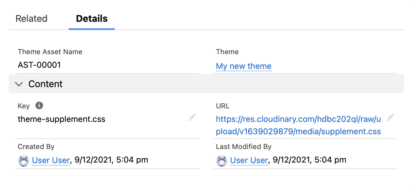
Preview the site. The new asset has overridden the site font, and the rest of the built-in theme still applies.
Translations
Translation strings are stored in translations/en.default.json and accessed with the t filter:
```liquid
{{ “products.show.add_to_cart” | t }} {{ “checkout.title” | t }} ```
Translation file structure:
```json
{ “products”: { “show”: { “add_to_cart”: “Add to Cart”, “discontinued”: “This product has been discontinued” } }, “checkout”: { “title”: “Checkout” }, “cart”: { “header”: “Shopping Cart” } } ```
Theme variables
theme_variables provides key-value configuration for the theme. These are stored as theme variable records in StoreConnect. The built-in theme provides defaults (for example products.per_page: 12) that custom theme variables override.
```liquid
{% assign per_page = theme_variables[“products.per_page”] %} {% assign show_compare = theme_variables[“products.comparisons”] == true %} {% assign image_ratio = theme_variables[“images.ratio”] %} ```
Customizing the base theme with CSS variables
The quickest way to rebrand the base theme is to override its CSS custom properties — variables the base CSS exposes for colors, fonts, and spacing on :root. There are two places to set those overrides:
- Store global CSS (recommended for per-store branding) — set the
:rootoverrides on the store’scustom_stylesvia theupdate_storeagent tool. This needs no theme file.custom_stylesis the same field surfaced in Liquid ascurrent_store.global_css, which the layout renders inside a<style>block (see Including assets in the layout above), so the overrides load on top of the base theme automatically. theme-supplement.css(theme-author / build-time route) — bake the same overrides into the theme’s supplement stylesheet, as shown below.
The base CSS exposes these variables on :root:
Color variables
```css
:root { –sc-color-primary: hsl(212, 100%, 50%); /* Buttons, links, highlights / –sc-color-secondary: hsl(0, 0%, 15%); / Secondary actions / –sc-color-error: hsl(0, 100%, 45%); / Error states / –sc-color-sale: hsl(0, 100%, 45%); / Sale prices */ } ```
Each color also exposes HSL channels for flexible manipulation: --sc-color-primary-h, --sc-color-primary-s, --sc-color-primary-l.
Font variables
```css
:root { –sc-font-family: -apple-system, BlinkMacSystemFont, sans-serif; –sc-font-base: 16px; –sc-font-medium: 18px; –sc-font-large: 20px; –sc-font-xlarge: 24px; } ```
Spacing variables
```css
:root { –sc-spacing-small: 10px; –sc-spacing-base: 20px; –sc-spacing-large: 30px; –sc-spacing-xlarge: 40px; } ```
Overriding variables
For per-store branding, set these overrides on the store’s custom_styles via update_store — no theme file required:
```css
:root { –sc-color-primary: hsl(142, 71%, 45%); –sc-color-secondary: hsl(142, 71%, 25%); –sc-font-family: “Inter”, sans-serif; –sc-spacing-base: 24px; } ```
The layout renders current_store.global_css (the Liquid name for custom_styles) inside a <style> block, so these overrides apply on top of the base theme automatically.
Theme authors can instead bake the same overrides into theme-supplement.css to ship a rebrand inside the theme itself:
```css
/* theme-supplement.css — minimal rebrand */ :root { –sc-color-primary: hsl(142, 71%, 45%); –sc-color-secondary: hsl(142, 71%, 25%); –sc-font-family: “Inter”, sans-serif; –sc-spacing-base: 24px; } ```
Either approach gives you the full base theme layout and components with your brand’s colors, fonts, and spacing, with no build step required.
Built-in utility classes
The base theme CSS includes responsive utility classes:
Responsive grid
| Class | Mobile | Medium+ |
|---|---|---|
sc-one-to-two-column |
1 col | 2 col |
sc-one-to-three-column |
1 col | 3 col |
sc-one-to-four-column |
1 col | 4 col |
sc-two-to-four-column |
2 col | 4 col |
sc-two-to-five-column |
2 col → 5 col | scales up |
Responsive visibility
sc-hide-up-to-small— hidden below 576pxsc-hide-up-to-medium— hidden below 768pxsc-hide-medium-and-up— shown only on mobilesc-hide-large-and-up— shown on mobile and tablet only
Layout utilities
sc-container— centered content container (max-width 1700px)sc-container-skinny— narrow containersc-flex-col— flex column layoutSC-Grid,SC-Grid_main,SC-Grid_sidebar— grid system
Breakpoints
| Name | Min-width |
|---|---|
small |
576px |
medium |
768px |
large |
992px |
xlarge |
1400px |
huge |
1700px |
Base CSS/JS is optional
The sc- prefixed CSS classes, responsive grid utilities, and JavaScript modules described above are all part of the built-in base theme — a reference implementation. They are loaded by the base theme’s {% require "styles/theme.css" %} and {% require "scripts/theme.js" %} calls.
Custom themes are not required to use any of this. You can: - Replace the entire CSS with your own framework (Tailwind, Bootstrap, and so on) - Use a completely custom build system - Write vanilla CSS with no framework at all
The only things a layout must include are the system variables ({{ csrf_meta_tags }}, {{ body_content }}, {{ theme_bar }}, and so on) and the {{ theme_supplement_stylesheet }} / {{ theme_supplement_javascript }} outputs. Everything else — including the {% require %} calls for base CSS/JS — is your choice.
:::tip
Keep {% require "scripts/theme.js" %} in your layout unless you are also replacing the component reloader (liquid-components.js) that powers async component updates.
:::
Using modern CSS frameworks
Tailwind CSS
-
Create a CSS entry point (
src/theme.css):css @import "tailwindcss"; -
Build to a single CSS file:
bash npx @tailwindcss/cli -i src/theme.css -o dist/theme-supplement.css --minify -
Upload
dist/theme-supplement.cssas a theme asset with the keytheme-supplement.css. It is automatically loaded via{{ theme_supplement_stylesheet }}.
Using Tailwind in Liquid templates:
```liquid
{{ current_product.name }}

```
Bootstrap
Build Bootstrap CSS locally and upload as a theme supplement:
```bash
npm install -D bootstrap sass npx sass src/theme.scss dist/theme-supplement.css –style=compressed ```
Vanilla CSS
For lightweight themes, vanilla CSS with custom properties requires no build step:
```css
/* theme-supplement.css */ :root { –color-primary: #2563eb; –container-max: 1200px; –gap: clamp(1rem, 3vw, 2rem); }
.container { max-width: var(–container-max); margin: 0 auto; padding: 0 var(–gap); } ```
Framework comparison
| Approach | Build step | Best for |
|---|---|---|
| Tailwind CSS | Yes (CLI) | Rapid development, utility-first design |
| Bootstrap | Optional | Teams familiar with Bootstrap |
| Vanilla CSS | None | Simple themes, maximum control |
| Base theme CSS | None (built-in) | Extending the existing theme |
Tips for any framework
- Always output
{{ theme_supplement_stylesheet }}in your layout — this is how your custom CSS gets loaded. - You can omit
{% require "styles/theme.css" %}if replacing the base CSS entirely. - Keep
{% require "scripts/theme.js" %}unless you are also replacing the base JavaScript (component reloader, and so on). - Use
{{ "filename" | asset_url }}for static files (fonts, images) uploaded as theme assets.
Was this article helpful?
Thanks for your feedback! It helps us improve our docs.