

Menu builder
On this page
Use the Menu Builder to build your own site navigation instead of relying on the default menu.
To create a custom menu, you create a single Menu record and a Menu Item record for each navigation item. The Menu Builder gives you powerful options to build custom menus that include dropdown menus and mega menus (menus that include images).
The menu builder is not limited to custom menus for headers and footers; you can create additional menus to use within custom containers or pages.
:::note At this point in time, there is no ability to preview your menu within Salesforce. To preview a menu, create a test store and assign the menu to it while you are testing. :::
Ways to customize your header
You can customize your store header in three ways.
-
Using the default menu which allows you to only adjust which product categories are shown in the navigation bar. See Design site navigation for products.
-
Using the Menu Builder with StoreConnect’s default header, which includes your logo, a search bar, the login or account link (depending on whether the customer is logged in), and the cart. You control what appears in the navigation menu. This is the option described below.
-
Building a custom header in HTML and rendering your menu with Liquid. This gives the most flexibility for complex header designs. There is an HTML and Liquid header boilerplate you can customize in Customize your store header.
How to create a custom header menu
When you create and associate a custom menu as a header menu, it will replace the default menu created with your Navigation Product Categories and will be shown in this area of the default header.

To create a custom menu:
Step 1: Create the menu
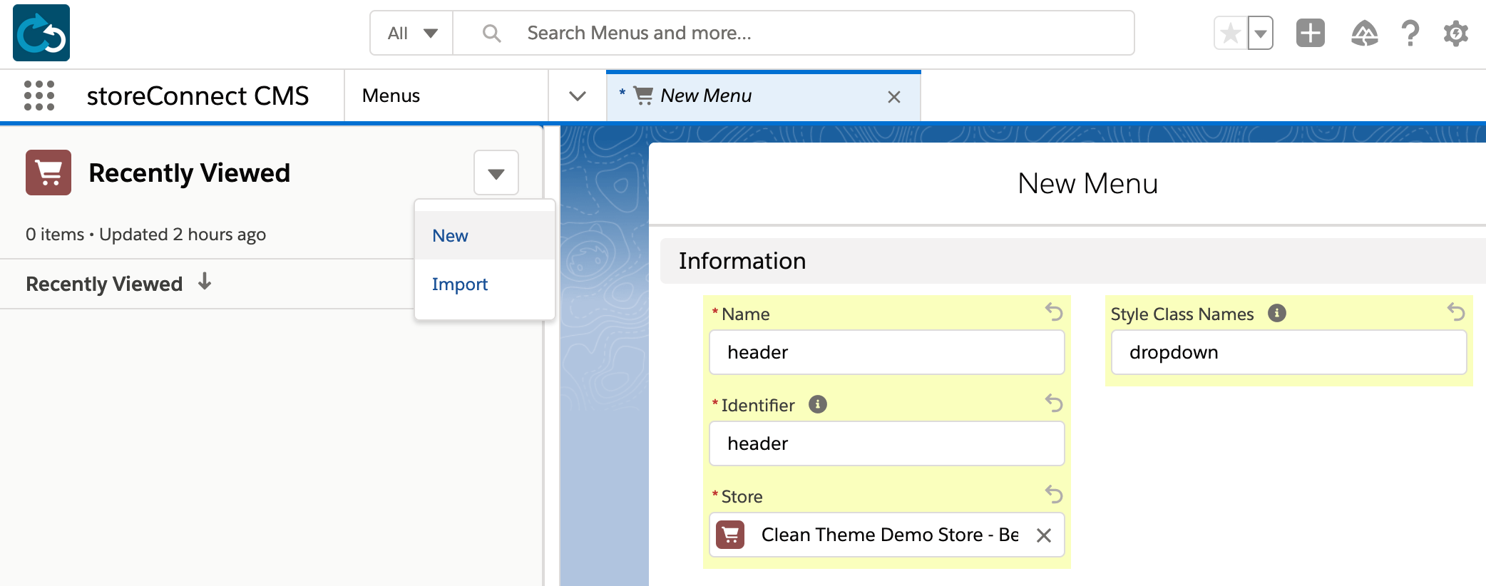
Create a Menu with Identifier set to header and Style Class Names set to dropdown.
Step 2: Create the menu items
-
On your Menu record, select the Related tab and find the Menu Items related list.
-
Select New. A new window opens.
-
Fill in Name, Display Name, Identifier, and Menu. All four are required for the menu item to display. If a Menu Item has children, add
dropdownormegato its Style Class Names so the children display. (Optional) Set Menu Item Image to display an icon-size image on the left of the menu item.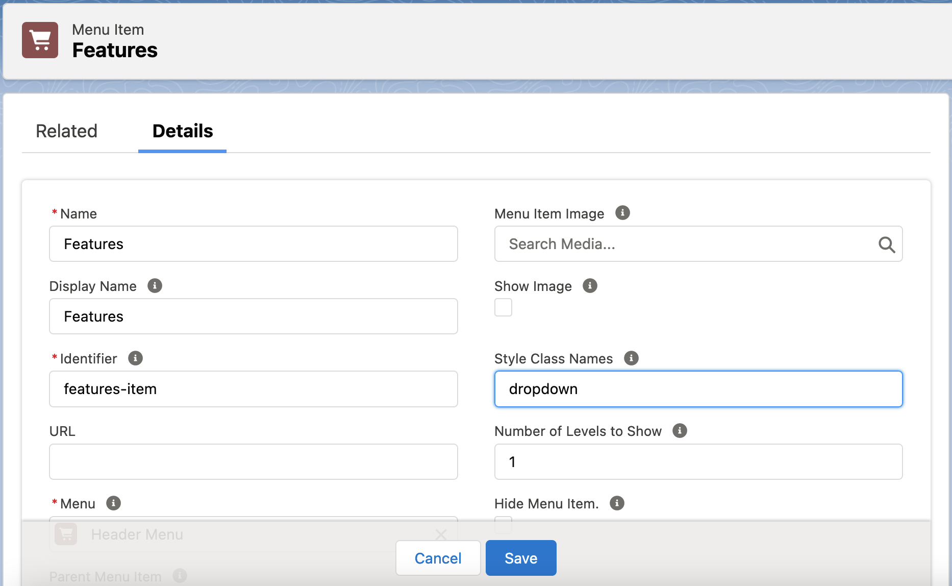
-
Set one target for where the menu item navigates to. If you choose an Article Category, Product Category, or Page, the children of that category can be shown in a dropdown automatically when
dropdownormegais in Style Class Names. For example, a Product Category of Cars shows Cars in the menu, and withdropdownin Style Class Names it shows a dropdown list of the products within Cars. Use the URL field instead to send the customer to a custom URL or another site. -
To add child menu items, go to the Related tab of the item you just created and select New. Repeat steps 1 to 4 for as many items as you need.
:::note The Menu Builder supports up to three tiers of menu items. Only use the style class name on the top menu item. Using the dropdown or mega class from the second tier and down will prevent your child items from displaying. :::
Step 3: Assign the menu to your store
- Open your Store record.
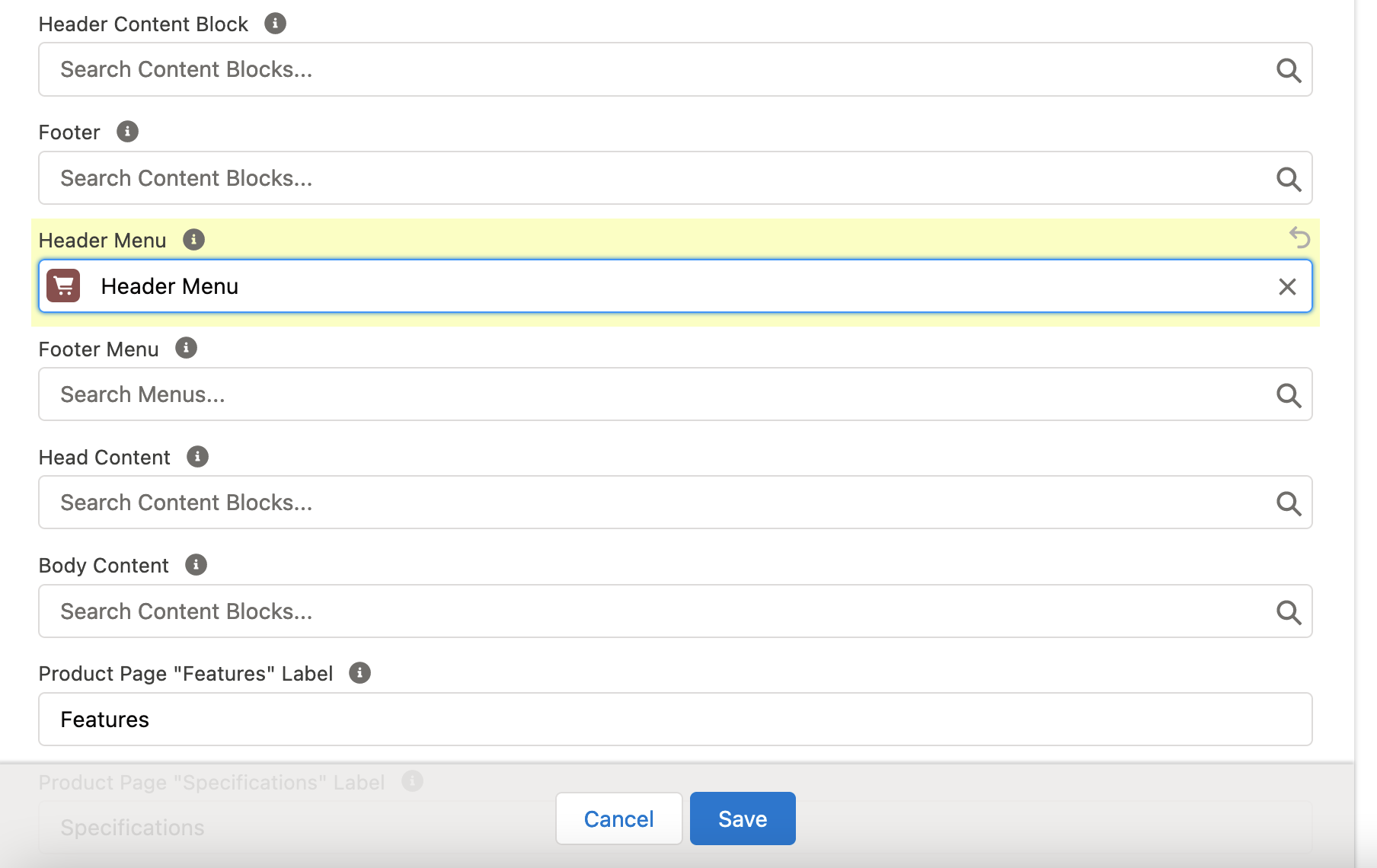
- In the Content Management (CMS) section, find the Header Menu field.
- Select the pencil icon to edit the field.
- Search for your header menu by identifier or name.
- Select your header menu.
- Select Save.
Load your storefront. The header navigation now shows your menu items instead of the product categories, and any item with the dropdown class expands on hover. Changes can take up to two minutes to appear.
Optional: how to use your menu in a custom header
Even in a completely custom header, it is worth rendering a Menu record rather than hardcoding the links. Non-technical users in your Salesforce org can then edit the menu without editing the HTML.
Assuming you are using the recommended HTML markup from Customize your store header, insert your menu as follows:
```liquid
```
You can insert a menu into any markup of your own, with your own CSS classes. The identifier does not have to be header; the Liquid looks up whichever identifier you supply.
Responsive menu and trigger button
If your custom header has a button that opens the menu on handheld devices, that button element needs the menu’s identifier.
The standard hamburger button carries a data-menu-init attribute whose value is the menu’s identifier, for example header. That triggers the responsive menu with the header identifier on handheld devices, but not on tablets.
```html
If your menu uses another identifier, replace header with it.
How to create a custom footer menu
A footer menu built this way lets non-technical users in your Salesforce org edit it without editing the HTML.
- Create a Menu with an Identifier of your choice, such as
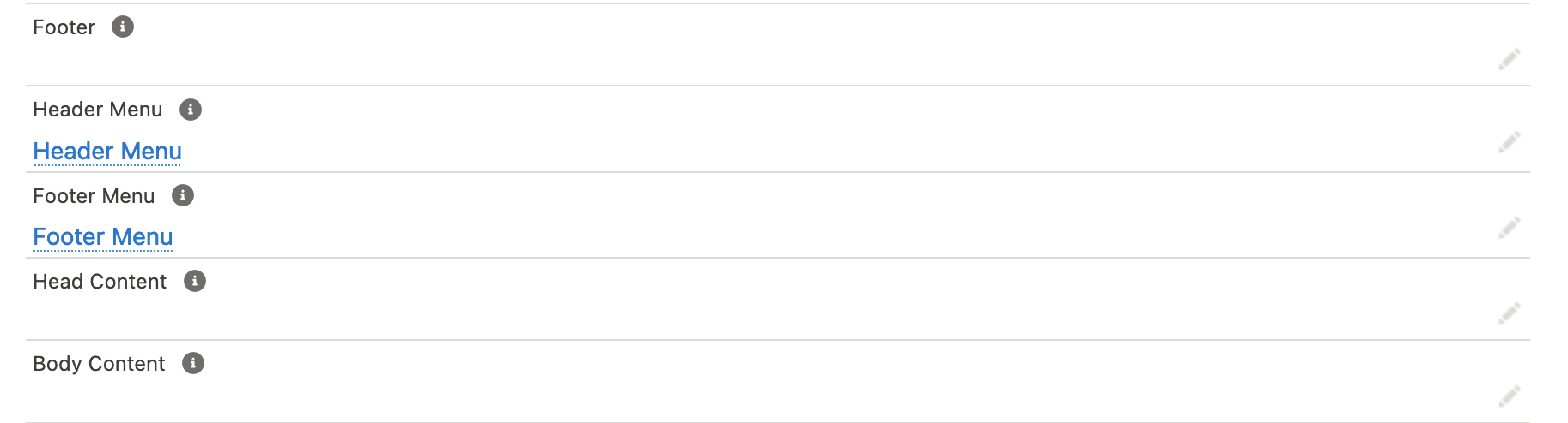
footer, and add its Menu Items as described in step 2 above. - Open your Store record and find the Footer Menu field in the Content Management (CMS) section.
- Select the pencil icon to edit the field.
- Search for your menu by name or identifier, and select it.
- Select Save.
The footer menu appears on your store within about two minutes.
:::note
Don’t use the dropdown class on a footer menu. It hides the items on handheld devices.
:::
Optional: how to use your menu in a custom footer
A completely custom footer needs Liquid to render the menu. The menu can then change without anyone editing the HTML.
Find the section you want the menu in and add the following, where footer is the menu’s identifier:
```liquid
{{ all_menus[“footer”].render }} ```
:::note
To align footer menu items vertically, add the stacked class to the menu’s Style Class Names field.
:::
Images
Check Show Image (s_c__Show_Image__c) on a Menu Item to display a thumbnail-size image alongside it.
This suits header menus with product images, custom social bars, and any menu that needs a thumbnail per item.
General information
Styling customization
Both the built-in classes and your own classes go in the Style Class Names field (s_c__Style_Class_Names__c), separated by spaces. These built-in classes change how a menu or menu item displays:
| Class | Applies to | Effect |
|---|---|---|
dropdown |
Menu, Menu Item | Displays children in a dropdown. |
mega |
Menu Item | Displays children in a full-width mega menu. |
wrap |
Menu | Wraps columns so menu items without children align vertically. Mostly used in mega menus. |
subtle |
Menu Item | Makes the link semi-transparent. |
end |
Menu | Aligns child menu items to the right of the block. Dropdowns inside are anchored from the right. The account menu uses this. |
center |
Menu | Positions menu items in the center. |
space-between |
Menu | Spaces items apart and expands the menu to 100% of its parent container. |
space-around |
Menu | Spaces items before, between, and after, and expands the menu to 100% of its parent container. |
stacked |
Menu | Stacks menu items vertically. Useful on footer menus. |
You can add your own classes if you need more customization. There are also extra default CSS classes for styling menu items, listed in Default CSS styles.
To push the menu items that carry images to the end of a menu, give those items a class name of your own in Style Class Names, then set its flex order in your store’s custom CSS. Using menu-image-item as the class name:
```css
.menu-image-item { order: 1; } ```
To push an image to the far right of a menu, target the menu item for the preceding column by its id. StoreConnect renders each menu item with the id SC-MenuItem-<menu-identifier>-<menu-item-identifier>, so with a menu identified as header and an item identified as about:
```css
SC-MenuItem-header-about { flex-grow: 1; }
```
Native child categories, articles, or pages
Set Number of Levels to Show (s_c__Child_Category_Levels__c) on a Menu Item to display the linked category’s own children without creating a Menu Item for each one. Any Menu Items you did create appear after these native children. The item still needs dropdown or mega in Style Class Names.
Dropdown menus
- A Menu that contains dropdown menu items needs
dropdownin Style Class Names. - A Menu Item needs
dropdownormegafor its children to display.
Including in other content blocks
You can render menus inside other content blocks. To build a social bar driven by a footer menu, create a Content Block with Template set to No added styling, put the following in its Content field, and set it as the Footer field on your Store record. It renders footer-menu followed by sitemap-menu.
```liquid
```
Troubleshooting
When updating your header and footer items, you may notice a delay in them updating on your site. These changes can take up to two minutes to come through.
If your menu is not showing up, check that it is assigned to the store you are working on. When you work across several stores, give each menu a unique name so it is clear which store it belongs to.
If menus disappear on handheld devices, check whether the menu carries the dropdown class. dropdown and mega are intended for menus at the header level.
Was this article helpful?
Thanks for your feedback! It helps us improve our docs.