

Simple donation theme
On this page
The Simple Donation theme is built for nonprofit organizations, for capturing donations and selling products.
Download the installable theme as a .zip, then use the theme importer to install it in your Salesforce org. The source is in the simple donations theme repository.
Key features
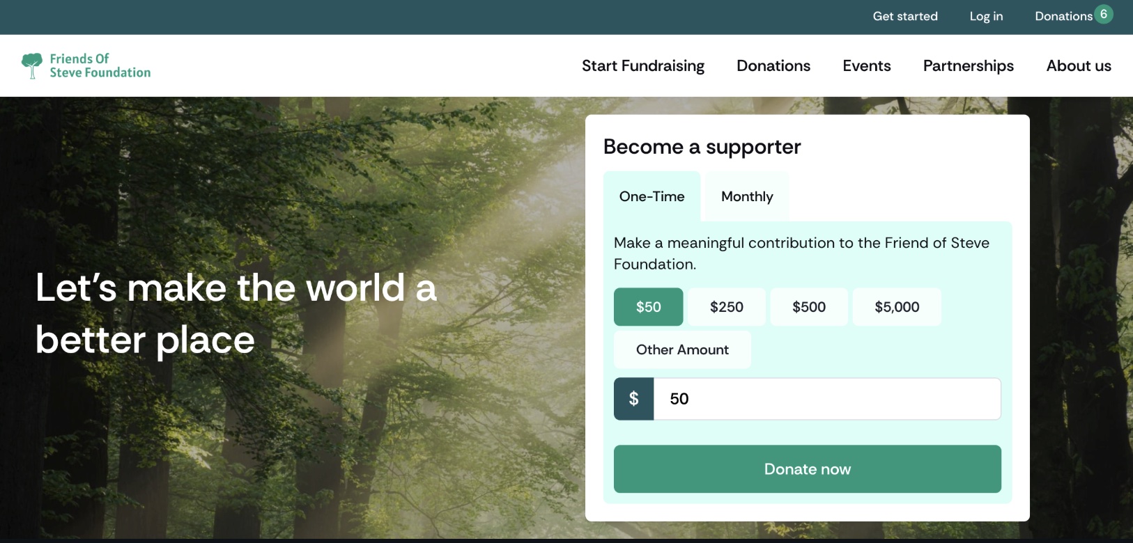
1. Image with overlay and donation box
Highlight impactful visuals by adding a donation box directly over images, making it easy for users to contribute.
2. Single campaign cards
Showcase individual campaigns with dedicated cards. Link a product to the content block, and the template will handle the rest for you.
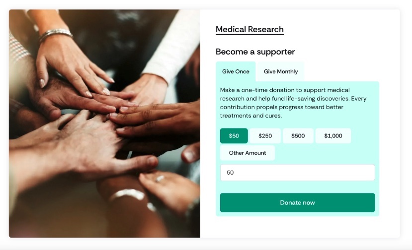
3. Variable pricing picker
Allow users to select their own donation amount with a flexible pricing picker. Perfect for donation products that offer custom contributions.
4. Images with titles and content
Add titles and supporting text to your images to create visually compelling sections that deliver powerful messages.

5. Top header
Includes quick-access links for:
- Get Started
- Account access
- Shopping cart

6. Product page templates
Easily choose from various page templates to suit your needs:
- Content-type pages — for structured layouts.
- Full-width landing pages — for standalone single-campaign pages and landing page designs.
7. Progress bar
Show the progress of your fundraising goals with a visually appealing progress bar. Use it for individual campaigns or display a global campaign progress tracker to keep donors engaged.

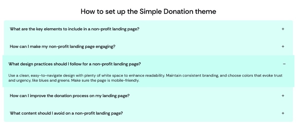
8. Accordion
Organize and display custom content with an interactive accordion.
Useful for:
- FAQ sections.
- Extra information about donation products or merchandise.
9. Featured donations
Highlight key campaigns with a featured donations carousel. Showcase outstanding donations to promote them and provide quick access to their respective pages.
:::note The progress bar selector and page templates picklist may require minor additional configuration for your organization. :::
Modified content block templates
containerfeatured_productsimageimage_beside_textimage_text_overlayslideshow
New content block templates
accordiondonation_carddonation_progress_bartestimonial_slider
New components
cart-menu
The new templates are not in the Content Template picklist by default. Add each one before you can select it; see adding your own custom content block templates.
Build content with this theme
Before getting started, note that some templates will require additional configuration within your organization upon installation.
Each template supports its own set of fields, listed below. You can still use any of the out-of-the-box templates alongside them; see content block templates for the fields those support.
Supported fields and relationships
Accordion
Supported fields:
- Title
- Content
Container
Supported fields and values:
- Alignment
text-center: Centers the headline and call-to-action if populated.
- Title
- Subtitle
- Child content blocks
- Link label and target
Donation card
Primary uses:
- Relate a product to dynamically populate the image and content.
- Provide custom content by not linking a product.
Supported fields:
- Product: If a product is linked, no image or content needs to be manually set. The product relationship also generates a donation box with a variable pricing picker if the donation product supports custom donations.
Optional fields, for custom content:
- Image
- Title
- Subtitle
- Content
- Link target and label
Donation progress bar
StoreConnect does not ship these fields. You create them in your own org, and you are responsible for keeping their values current.
- Add two custom fields to the Store object (
s_c__Store__c):Donations_Total__candDonation_Target__c. - Create a Custom Data Mapping record for each field, naming the object and the field API name. A custom field is not readable from a Liquid template until it is mapped. See custom data fields in Liquid.
- Create a content block using the donation progress bar template, and assign it to the page where you want the bar to display.
Featured products
Supported fields:
- Title
- Link target and label
- Products (Relationship Type)
- If 4 or fewer products are related, a grid layout is displayed.
- If more than 4 products are related, a carousel is displayed.
Image beside text
Supported fields:
- Image
- Title
- Subtitle
- Content
- Link target and label
Image text overlay
Supported fields:
- Title
- Subtitle
- Content
- Link target and label
- Type
- “Set the background color” applies an overlay and changes the font color to white.
- Product, as a relationship
- Displays a donation box on the right side.
- Alignment
- Center, left, or right.
- Video (takes precedence if both an image and video are provided).
- Image
Image
The single image template supports:
- Image
- Title
- Content (used as a caption)
- Link label and target (if set, turn the entire image into an anchor link with a hover effect)
Translation keys
A nonprofit store often needs different wording from a retail one. StoreConnect exposes its display strings as translation keys you can override.
For example:
- Replace “cart” with “basket”.
- Use “donor” instead of “customer”.
The theme includes a predefined set of translation keys, and you can extend them using the base theme’s default translation keys as a reference.
Variables
Activate or deactivate specific components by modifying the following variables. If a variable is not set or set to false, the component will not display.
product.social.share:activestore.allow.promo.codes:false
Was this article helpful?
Thanks for your feedback! It helps us improve our docs.